Review of New Logos 2020
Recent changes have been made to logos representing Froot Loops, Popeyes, and BMW.
Back to menuWe’ve witnessed several brands undergo various forms of rebranding over the years. It’s an effective strategy to keep a brand fresh, relevant, and up to date with current trends and events in the zeitgeist. 2020, in particular, has been the year of logo transformations. It would only feel natural to change up a logo that’s been the face of a company for 20, 30, 40+ years, especially with modern, technological advancements, improvements to graphic design, and new trends. Recent changes have been made to logos representing Froot Loops, Popeyes, and BMW. As a branding and design agency, it would only be appropriate if we provided our commentary. However, let’s not forget design is subjective. So you may or may not agree with us!
Toucan Sam for Froot Loops
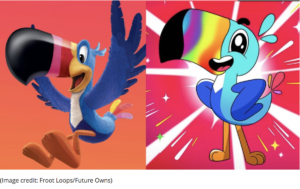
Did we go back in time? To an era with limited design resources? That is our assumption, based on the fact that the Toucan Sam mascot went from 3-dimensional to 2-dimensional, something that defies avant-garde design standards. The mascot of Froot Loops, the children’s cereal by Kellogg’s, went from a pleasantly soft color palette to an aggressively neon palette with a design closely resembling that of the ever-so-nostalgic Lisa Frank. Except for the fact that the mascot remains the same kind of bird, there are no other qualities that have remained consistent or recognizable, which goes against the fundamentals of a brand itself. Also, the Fruit Loops logo still has a 3D dimension style with the realistic “loops” as part of the logo. The new flat design of Toucan Sam feels disconnected when paired with the Fruit Loops logo. Perhaps illustrators felt the need to amplify the mascot’s characteristics in order to regain the fleeting attention and “easily bored” nature of today’s youth. In a weird way, its electric and overly-vibrant look almost seems to amplify how artificial the cereal is. With that being said, our office is not full of Kellog’s primary demographic (kids), so we are for the Toucan Sam we grew up with. In our opinion, the mascot could have been illustrated in a way that still reflected the old bird, but gave it more design elevation for 2020. Only time will tell whether the new Toucan Sam affects Fruit Loops sales.
Popeyes
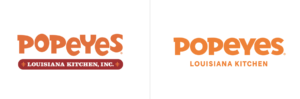
To claim that Popeyes took off this past year would be an incredible understatement. The release of its now highly-praised and famous chicken sandwich raised its sales and popularity exponentially nationwide. The new chicken sandwich brought its brand top of mind for consumers within the fast-food fried chicken sector of the market alongside competitors like Chick-Fil-A. Countless sources would report locations sold out of their items. The new logo faced a way less dramatic transformation and more positive feedback. AdWeek described it as “more mature and streamlined.” It went from being multi-colored to capitalizing on its primary orange color and maintaining its Louisiana roots. The secondary logo now incorporates a chicken visual, which might symbolize its elevated presence as a leading fried chicken establishment. Popeyes changed not only its primary and secondary logos but also its overall aesthetic and identity. They updated their packaging and restaurant interiors. Now items like cups, wrappers, bags, and boxes will match, incorporating the one recurring color and the playful chicken illustrations. We give Popeyes two thumbs up because it renewed its logo simply and seamlessly while retaining its brand identity and connection with their already existing audience.
BMW
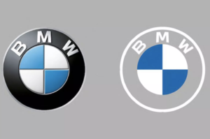
The reversion to flat, untextured design is a trend BMW hopped on. BMW, ironically a luxury brand of automobiles, made its new logo rather humdrum. Designers removed the previously black, textured background, which gave it a sleek and chic look and feel, and opted for a white outline, which provides the logo with a transparent effect making it easily dismissable and harder to see. Whether we admit it or not, consumers often purchase products of luxury brands for the logos themselves, as they indicate wealth, status, and style. By watering down its design, BMW took its classy branding down a considerable notch, and it wouldn’t be surprising if they saw a decline in sales. According to BMW, its transparent logo serves to “express openness and transparency,” Supposedly, the company is trying to revise its identity. While the intent is there, it’s not as “clear.”
(850) 296-8363 | 522 East Park Ave., Suite 201, Tallahassee, FL 32301
© Copyright 2021. All rights reserved.